
'PRINT-READY' ARTWORK
Supplying artwork that isn’t print-ready can lead to a few headaches in the printing process, bobbins in, bobbins out, as they say. Avoid extra costs and delays by considering the advice below BEFORE you start creating your artwork.
I strongly recommend the Adobe products, InDesign, Illustrator and Photoshop, there is a great deal of control with these products and you will be able to create your artwork as required, PowerPoint is widely available and commonly used for creating artwork but works in RGB (see COLOURS below) and doesn’t warn if fonts aren’t present.
To ensure a smooth printing process and the best possible outcome, it’s crucial to provide print-ready artwork that adheres to the printer’s specifications regarding file format, resolution, color profiles, bleed, and trim marks. This way, you’ll save time, avoid potential issues, and ensure a high-quality final product. If we need to make corrections or adjustments to non-print-ready files, it could result in additional charges for the time and resources required to make the artwork suitable for printing.
PAGE SIZE
Ensure your document is set up at the size you want to print it, this will ensure images aren’t scaled and become pixelated, it also saves the printer a job that they may charge for!
If it’s not possible to create it at full-size, do it at half or quarter size and double or quadruple the resolution of images so they print correctly when scaled up.
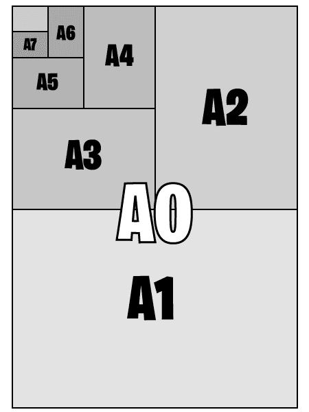
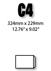
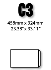
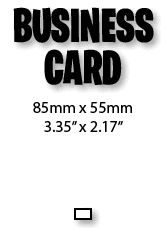
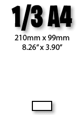
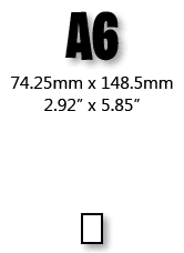
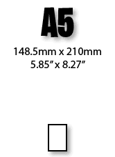
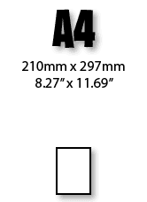
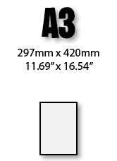
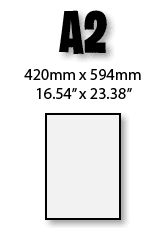
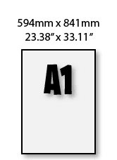
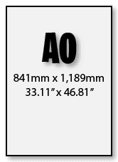
In the UK, page sizes are commonly ‘A’ sizes – from A0, the largest, down to A6 and smaller. This graphic shows the relationship between these sizes.
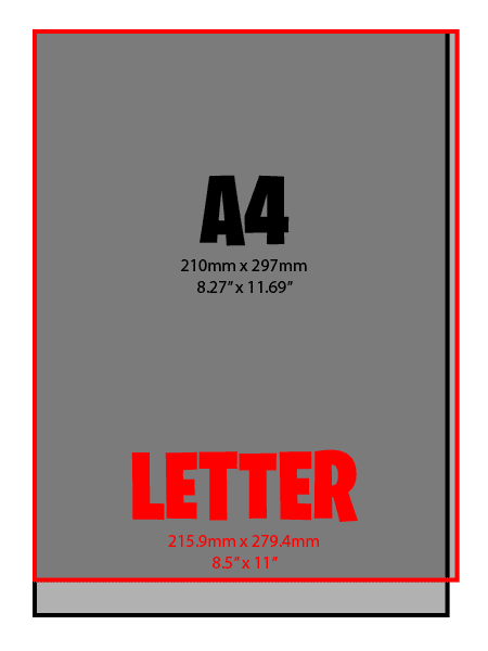
Microsoft Word will often start with a letter-sized piece of paper, this is an American standard and is different to an A4, you can see how to change it to A4 here. (to follow shortly)
BLEED AND MARGINS
Probably the single most important thing to get right when setting up your artwork.
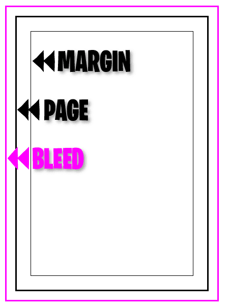
If you want to print to the edge of the sheet, you MUST have bleed. This is an area of artwork outside the finished sheet, typically 3mm, that holds artwork but is trimmed off, this ensures no unsightly white bits on the edges of the sheet remain, or sheets trimmed smaller than you intended!
The margin is an area inside the finished sheet where there are no small design objects (text, logo’s, important images, etc). This ensures nothing important gets trimmed off and provides a nicely spaced border to your design. Slight imperfections in the print placement on the sheet are more easily noticed if there is a very small margin. I would suggest a minimum of 5mm for the margin.
MICROSOFT WORD
Different versions of Word can move text and images around if spaces are used instead of tabs and carriage returns used instead of page breaks. To avoid this save your file as PDF.
ADOBE PHOTOSHOP
Flatten your Photoshop images to reduce the file size and avoid font issues.
MICROSOFT POWERPOINT
PowerPoint’s A4 document size isn’t A4, when I looked on mine it came in at 27.517cm x 19.05cm, not 29.7cm x 21.0cm!
See Change the paper size in PowerPoint here.
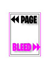
Page setup in design software includes bleed margin.
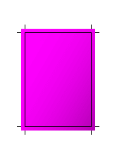
Design created, all artwork extends to the bleed margin where necessary.
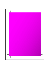
Design is printed to an oversize sheet, includes crop marks to aid trimming.

Oversize sheet is trimmed to the crop marks.
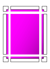
Showing trimmed areas including discarded bleed…

…to leave the finished article with print to the edge of the sheet.
IMAGES AND RESOLUTION
Low quality images can really affect the overall appearance of your printed item, make sure the resolution is high enough for your needs. A leaflet that will be held in a persons hand needs to be much higher resolution than a poster that is six feet away. A3 and smaller should be 300dpi (dots per inch) and large format printing should be 100dpi, although in reality, you can go a bit lower than these without it being too noticeable. Images from the internet are not high resolution, typically 72dpi, so need to be very large to be suitable for printing. There are many websites selling high quality images that could be suitable for your needs.


ADOBE ILLUSTRATOR
If you want to send me an Illustrator file, you will need to include all the fonts and linked images. Much easier to save as PDF, see How to save a PDF from Illustrator here.
ADOBE INDESIGN
There is a menu command in InDesign, ‘Package…’, which will collect all the files used in the file into a single directory, it also warns of any font licensing issues, see How to ‘Package’ a file in InDesign here.
MICROSOFT EXCEL
Ensure you have set up each tabs’ ‘Page setup’ and ‘Print Areas’ correctly.
See Page setup and print areas in Excel here.
COLOUR
Your artwork should be created in, or converted to, CMYK (Cyan, Magenta, Yellow and Key (Black)) as these are the colours of the inks that printer devices use.
Camera’s and scanners produce colour in RGB (Red, Green, Blue) and these must be converted to CMYK before printing. There are colours available in RGB that are not available in CMYK, usually very bright and vivid colours, so some vibrancy can be lost when printed. There is quite often a noticeable difference between your computer monitor, as this uses an RGB colour system, and a printed sheet, and where this is critical, companies can spend a great deal of money and time ensuring this is minimised.
Offset lithography can use CMYK Inks but also a fifth or sixth Pantone ink which are colour specific, so colour accuracy can be ensured for corporate branding.
FONTS
Fonts are installed on computers and displayed on the screen as the text, so when you send a file to another computer, if it doesn’t have that font, it won’t display or print correctly and a default one used instead.
Word and PowerPoint will not warn you if a font is missing, you should save the file as PDF to avoid this when sending to me (see embedding fonts in PDF when using Word and PowerPoint). The same is required for ‘proper’ design software although some fonts will have licensing restrictions that don’t allow them to be embedded into PDFs, in this case you should outline all the text in your file.
PROOFING
Whether you do the artwork, I do the artwork or someone else does the artwork, check, check and check again for spelling mistakes, incorrect information, grammatic errors, etc. as it’s disappointing to spot them after printing!
I do not offer a proof reading service but will always let you know if I spot something that I don’t think looks right.
FILE FORMATS
PDF is the preferred format to send your files to me, it minimises the chance of errors and should print how it looks on screen, most software will Save As or Export to PDF. I can also accept InDesign, Illustrator, Photoshop, PowerPoint and Word files. For other formats, please contact me.

A compressed filetype, needs a third party app or online tool to decompress them.

Post production Adobe After Effects video file, allowing graphics and other animations.

Adobe Illustrator vector drawing package for creating high resolution graphics.

Audio Video Interleave file, video and audio format.
Batch file.
A plain text file containing commands to run automated tasks.

Bitmap image file.
Lossless filetype, can be extremely large!

CorelDraw software. Convert to PDF*, AI, SVG, JPG or EPS before sending to me.

For use in web design. If you need a website designing, take a look at the services I offer.

Commonly used for mail merge jobs in InDesign or Word.

Dynamic Link Library. A shared library in the Windowes or OS/2 operating system

Microsoft Word. Used for word processing documents.

Microsoft Word.
Open Office XML format. (actually a ZIP file!)

Generic email.
Used by many email clients.

A generic vector graphics file format

Electronic Publication.
Supported by many electronic reading devices.

Denotes a file as being executable. Many Windows and Mac programs are .exe files.

A bitmap image format, good for simple images with up to 256 colours.

The language the web is written on

Desktop publishing package for creating single or multiple sheet layouts.

Contain graphics and animation, audio and video. A discontinued software platform.

Contains binary exactly as it appears on a CD, DVD, Blue-ray, etc.
Widely used lossy image type for digital images.

Widely used lossy image type for digital images.

A programming language used on the web.

A container of video, audio, image and subtitle tracks in a single file.

Video file format.

A compressed digital audio file, Moving Picture Experts Group Layer-3 Audio.

A digital multimedia contaainer used to store video and audio.

A format for scalable computer fonts.

Presents documents independent of the software used to create it.

A web scripting language processed on a web server to produce HTTP for a web browser.

A raster graphics image file format.

A slideshow presentation file format. Can contain text, images, music and videos.

A slideshow presentation file format. Can contain text, images, music and videos.
An image format that supports layers of graphics in a single file.

RAR is a proprietary archive file format that supports data compression.

RAW files contain uncompressed and unprocessed image data.

A text file that can hold formatting including bold, italics, font size, and margin settings.

Contains code to work with relational databases.

A tool for displaying 2D graphics, charts, and illustrations on websites.

A TTF file is a font that can be installed in macOS, Windows, and other platforms.

A text document that contains plain text in the form of lines.

A website URL shortcut that can be saved to computer with any website address.

An audio file format standard for storing an audio bitstream on personal computer

The original file extension for Microsoft Excel workbooks.

A Microsoft Excel Open XML Format Spreadsheet file.

An archive file format that supports lossless data compression.